Formatting Chart View Color
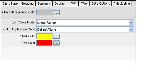
Follow these steps to configure the color used within the chart view.
- Click the Color tab.
- To specify a background color for the chart, click the ellipsis (...) button next to the Chart Background Color field, and select the color to use from the Color dialog.
- See Selecting Dashboard Colors for information on how to use the Color dialog.
- Select an Item Color Model. This selection determines how color is applied to the lines, columns, sections, or bars in your chart. Your Item Color Model selection determines whether or not the Start and End Color options are available. The following Item Color Models are available:
- Linear Range: The system assigns a color for each item in the chart based on the selected Start and End Colors.
- The Start and End Colors define a line in 3D color space, and the system selects colors along this line in a linear fashion (from the start to the end).
- The first item uses the Start Color and the last item uses the End Color. The remaining items use a color between the two along the color line. For example, if you have three columns and your start color is yellow and end color in red, the first column will be yellow, the second column will be orange, and the third column will be red.
- If you have multiple groupings, the Start/End Color pattern repeats for each grouping but each group's colors differ depending on the Color Application Model you selected.
- Linear Random: The system picks colors for the chart at random using the range of colors defined by the Start and End Colors you specify.
- If you have multiple groupings, the shading of the colors varies from group to group depending on the Color Application Model you selected.
- If you have multiple groupings, the shading of the colors varies from group to group depending on the Color Application Model you selected.
- Pure Random: The system picks the colors for the chart at random. You do not need to configure the Start/End Colors for this option.
- Wireframe: No color is used. Chart items are outlined in black. You do not need to configure the Start/End Colors for this option.
If you selected Linear Range or Linear Random for the Item Color Model, select a Color Application Model. This selection is only applicable if you specified two levels of grouping for the chart (Primary and Secondary). It determines the shading of each group in relation to the others.
Note that the selected Color Application Model applies subtle changes to your chart’s color. Depending on the Start and End Colors you select, you may not notice a difference when switching between the various options.
Default/None: The color shading does not differ from group to group. For Linear Range, all groups use the same colors.
- Increasing: The color brightness increases with each group from left to right.
- Decreasing: The color brightness decreases with each group from left to right.
- Oscillating: The color palette oscillates between bright and dark. In other words, the colors in the first group are bright, the second group's colors are dark, the third group's colors are bright, the fourth group's colors are dark, etc.
- Random: The color brightness is selected at random for each group.
- If you selected Linear Range or Linear Random for the Item Color Model, specify a Start Color and End Color. The colors between these two selections constitute the range of colors available for use in the chart. (The system picks the actual colors automatically.)
Copyright © 2014-2019 Aptify - Confidential and Proprietary
