About the Chart View Types
You can create charts using the following chart types:
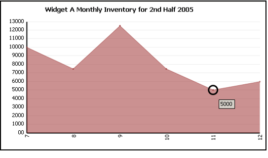
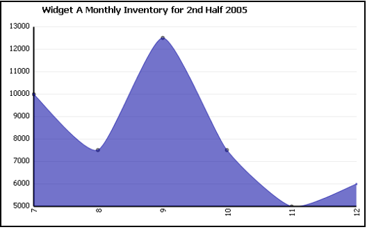
- Area Chart: An area chart emphasizes the amount of change over a period of time. It also shows the relationship of parts to a whole by displaying the total of the plotted values. An area chart is a form of a line chart, but the area between the horizontal axis and the line connecting the data markers is filled with color, making it easy to see where the points encompassed by the different data series overlap. A three-dimensional version of the area chart is also available.
- Area Chart 3D: A three-dimensional rendering of an area chart.
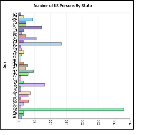
- Bar Chart: A bar chart compares individual items of data. Types of items are organized vertically while data values are shown horizontally, to emphasize value comparison and to minimize emphasis on time as a factor. A three-dimensional version of the bar chart is also available.
- Bar Chart 3D: A three-dimensional rendering of a bar chart.
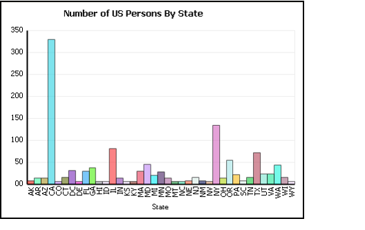
- Column Chart: A column chart shows the changes in a data series over time or compares multiple items. Types of items are arranged horizontally and data values are plotted vertically to emphasize variation over time. A three-dimensional version of the column chart is also available.
- Column Chart 3D: A three-dimensional rendering of a column chart.
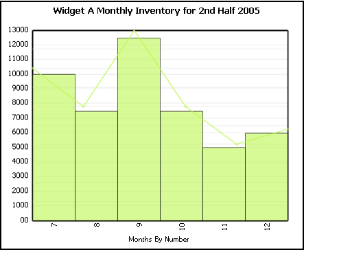
- Column Line Chart: A column chart illustrates comparisons among items or shows data changes over a period of time. Values are organized vertically and data is categorized horizontally. A line chart shows trends in data at equal intervals. The Column Line chart combines both types of charts, showing both categorized proportions and trends.
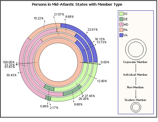
- Doughnut Chart: A doughnut chart shows the relationship of parts to the whole and can contain more than one data series, or grouping criteria. Each ring of the chart represents a different data series. You must specify two grouping levels when creating a doughnut chart.
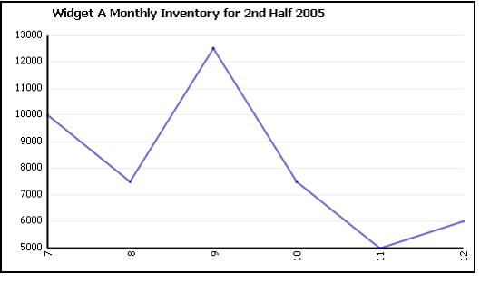
- Line Chart: A line chart plots data points in a series using evenly spaced intervals and connects the data points with a line to emphasize the relationships between the data points. A three-dimensional version of the line chart is also available.
- Line Chart 3D: A three-dimensional rendering of a line chart.
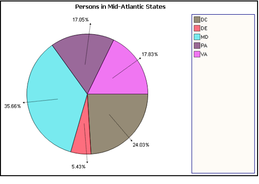
- Pie Chart: A pie chart shows the size of items that make up a data series proportional to the total of the items in the series. This chart always shows a single data series and is useful for determining which items in the series are most significant. A three-dimensional version of the pie chart is also available.
- Pie Chart 3D: A three-dimensional rendering of a pie chart.
- Spline Area Chart: A spline area chart is similar to an area chart but shows connections between data markers using curved lines to indicate the rate of change.
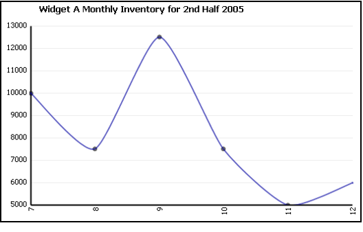
- Spline Chart: A spline chart is similar to a line chart but has lines with curvature instead of straight lines in order to emphasize the rate of change.
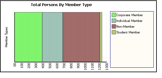
- Stacked Bar Chart: A stacked bar chart shows the relationship of individual items to an entire series. A three-dimensional version of this chart is also available.
- Stacked Bar Chart 3D: A three-dimensional rendering of a stacked bar chart.
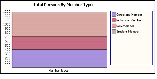
- Stacked Column Chart: A stacked column chart shows the relationship of individual items to an entire series. A three-dimensional version of this chart is also available.
- 3D Stacked Column Chart: A three-dimensional rendering of a stacked column chart.
Copyright © 2014-2019 Aptify - Confidential and Proprietary
