Defining Ribbon Group Buttons
This section describes how to define a button that appears in a ribbon group, the available actions you can use for a button, and the group button that appears in the lower right corner of a group.
Follow these steps to define the individual buttons that appear in a ribbon group:
- Open the Applications Ribbons record whose buttons you want to modify, if not already opened.
- Click the Application Ribbon Groups tab and open the group whose buttons you want to define, if not already opened.
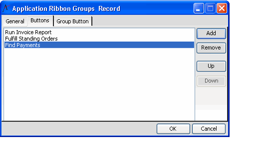
- Click the Buttons tab.
- Click the Add button to open a new Application Ribbon Group Buttons record.
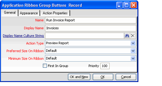
- Enter a Name for the button.
- Enter a Display Name for the button. This name will identify the button on the ribbon (if a Display Name Culture String is not specified).
- If localizing the system for other cultures, enter the Culture String that you want to use for this button's Display Name in the Display Name Culture String field. See Working with Culture Strings for more information.
- Select the Action Type for the button. See Defining the Ribbon Button Action Types for information on the available options.
- If you want this button to be the start of a new section of the ribbon group, select the First In Group option. This adds a line separate between the buttons that appear earlier in the button list and this new button.
Select the Priority for the button. This value controls the order in which the buttons appear within the ribbon. By default, all buttons have a value of 100 and their order is based on their order within the button list.
The Preferred Size On Ribbon and Minimum Size On Ribbon fields are reserved for future use. Aptify automatically determines the size of buttons to display based on the available display space.
- Click the Appearance tab.
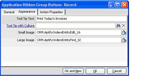
- Specify tool tip text in the Tool Tip Text field. This text appears when a user hovers over the button (if a Tool Tip with Culture String is not specified).
- If localizing the system for other cultures, enter the Culture String that you want to use for this button's tool tip in the Tool Tip with Culture field. See Working with Culture Strings for more information.
- Specify the Small Image and the Large Image to use for this button. These fields identify images in the Object Repository. The small image should be 16x16 pixels and the large image should be 32x32 pixels. If you leave these fields blank, the button will use the default book icon.
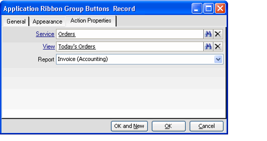
- Click the Action Properties tab and enter the appropriate information to define the action that occurs when this button is clicked. See Defining the Ribbon Button Action Types for more information.
- Click OK to save and close the Buttons record.
- Add additional buttons as necessary.
- Alternatively, you can click OK and New in Step 16 to save the current record and open a new Buttons record in one step.
- Alternatively, you can click OK and New in Step 16 to save the current record and open a new Buttons record in one step.
- Use the Up and Down buttons on the group's Buttons tab to determine the order in which the buttons will appear (if you did not define specific button priority values).
- Click OK to save and close the Ribbon Groups record.
- Save and close the Applications Ribbons record.
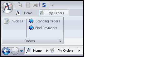
To review the ribbon group, select Home in the Navigation Bar and choose Refresh Folder List from the context menu. Then, browse to the application for which you configured the ribbon. The following figure illustrates a sample ribbon for the Order Entry application.
Related content
Copyright © 2014-2017 Aptify - Confidential and Proprietary
