/
Configuring the Button Bar Component
Configuring the Button Bar Component
The Button Bar component is a container for one or more action buttons that open forms, launch the Find dialog, and switch between dashboards.
Follow these steps to configure a part to use this component:
- On the General tab of the Dashboard Part form, select the Button Bar component from the Component field.
- Select the Properties tab.
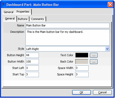
- Enter a name for the button bar in the Name field.
- Enter a Description.
- Select a Style: either Left-Right (for horizontal button bars) or Top-Bottom (for vertical button bars).
- Specify a Button Height and Button Width that the bar's buttons will use by default.
- The height and width are in pixels.
- Buttons whose Size Mode is set to Automatic use the default dimensions.
- Specify the Start Left and Start Top positions for the first button in the Button Bar.
- These values, in pixels, determine the position of the first button in the Button Bar.
- These values, in pixels, determine the position of the first button in the Button Bar.
- Specify the Space Width and Space Height positions.
- After using Start Left and Start Top to place the first button, the dashboard uses these values, which are in pixels, to automatically place additional buttons in relation to each other on the button bar.
- After using Start Left and Start Top to place the first button, the dashboard uses these values, which are in pixels, to automatically place additional buttons in relation to each other on the button bar.
- By default, the button bar's text is black. You can select a different Text Color, if desired, by clicking the ellipsis (...) to open a color selection dialog. See Selecting Dashboard Colors.
- By default, the button bar's background color is gray. You can select a different Back Color, if desired, by clicking the ellipsis (...) to open a color selection dialog. See Selecting Dashboard Colors.
- Click the Buttons tab.
- If prompted, click OK to save the button bar before continuing.
- If prompted, click OK to save the button bar before continuing.
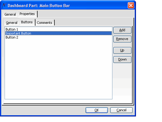
- Add one or more buttons to the button bar (see Adding a Dashboard Button for details).
- After adding buttons to the bar, rearrange the order of the buttons as necessary.
- To move a button up one position, select an item in the list and click the Up button.
- To move a button down one position, select an item in the button list and click the Down button.
- Click the Comments tab and add any additional information that you want to record concerning this button bar.
- Click OK to save the Dashboard Button Bar record and return to the dashboard layout.
- Click OK to save the Dashboard Parts record.
, multiple selections available,
Related content
Adding a Dashboard Area
Adding a Dashboard Area
More like this
Configuring Dashboard Part Components
Configuring Dashboard Part Components
Read with this
Configuring the Button Bar Component
Configuring the Button Bar Component
More like this
Creating a New Dashboard
Creating a New Dashboard
Read with this
About the Dashboard Button Bars Form
About the Dashboard Button Bars Form
More like this
Adding a Dashboard Part
Adding a Dashboard Part
Read with this
Copyright © 2014-2019 Aptify - Confidential and Proprietary

