About the Dashboard Part Form
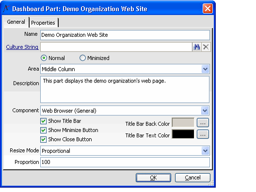
The Dashboard Part form defines the characteristics for parts which appear on the digital dashboard, such as views, web pages, and buttons. The Dashboard Parts form may only be opened from the Options menu on the Dashboard Areas form.
General Tab
Name (required)
The Name field stores the name of the dashboard part.
Culture String
The localized display name for the dashboard part. The appropriate name appears that corresponds to the user's assigned Culture. See Using Localization Administration for details.
Sizing Section (required)
The following options indicate whether the dashboard part appears in a minimized or maximized (normal) state when first launched. These options are updated when the user selects the Minimized or Maximized button. Only one option may be selected.
- Normal: The dashboard part displays in a maximized state.
- Minimized: The dashboard part displays in the minimized state.
Area (required)
The Area field links the dashboard part to the Dashboard area where the part is displayed. All Dashboard Areas associated with the dashboard are included in the list.
Description
The Description field stores the description for the dashboard part.
Component (required)
The Component field designates the dashboard component associated with the dashboard part. All Dashboard Components configured in the system are included in the list. See Configuring Dashboard Part Components for more information.
Show Title Bar
When this option is selected, the title bar for the dashboard part displays. This checkbox is selected by default.
Show Minimize Button
When this option is selected, a minimize button displays on the dashboard part title bar. This is only applicable when the Show Title Bar option is selected. This checkbox is selected by default.
Show Close Button
When this option selected, a Close button displays on the dashboard part title bar. This is only applicable when the Show Title Bar option is selected. This checkbox is selected by default.
Title Bar Back Color (required)
The Title Bar Back Color field defines the background color for the dashboard part title bar. This is only applicable when the Show Title Bar option is selected. The default background color is gray.
Title Bar Text Color (required)
The Title Bar Text Color field defines the color for text that displays on the dashboard part title bar. This is only applicable when the Show Title Bar option is selected. The default text color is black.
Resize Mode
Not currently supported.
Proportion (required)
The Proportion field specifies the proportion of the dashboard area that this part fills. This field is not currently supported. See Resizing a Dashboard Part for information on how to resize the dashboard parts in the same area. If two parts have a proportion of 50 each, they each fill 50 percent of the dashboard area. This field has a range of 0 to 100. The default value is 100. Note that Aptify calculates a weighted average for dashboard parts if their sum does not equal 100. For example, if two parts are in an area and the proportion for each part is set to 75, each part fills 50 percent of the dashboard area.
Properties Tab
The Properties tab contains the source data for the component selected in the Component field on the General tab of the Dashboard Parts form. The fields appearing on this tab change depending on the type of component selected. All positioning measurements are defined in pixels. Not all components have a Properties tab. See Configuring Dashboard Part Components for more information on Dashboard Parts.
Button Bar Component
The following tabs and fields appear on the Properties tab of the Dashboard Part form when the Button Bar component is selected.
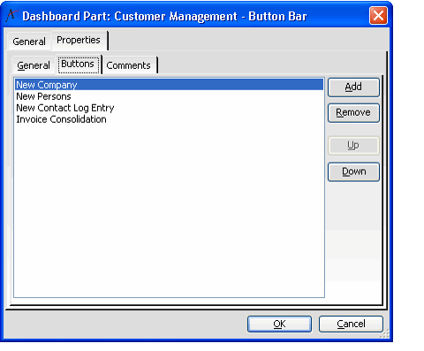
Buttons Sub-Tab
The Buttons sub-tab lists all buttons defined for the Button Bar and provides the ability to define the order in which the buttons are displayed. Buttons can be added, removed, or edited from this tab.
Add Button
The Add button displays a new Button Properties form, used to define a new button for the Button Bar. See About the Button Properties Form.
Remove Button
Clicking the Remove button removes the highlighted button from the button bar.
Up Button
The Up button is used to move the highlighted button further up the list, to manipulate the position on the bar where the button is displayed.
Down Button
The Down button is used to move the highlighted button further down the list, to manipulate the position on the bar where the button is displayed.
Comments Sub-Tab
All comments associated with the button bar dashboard part are listed on this sub-tab.
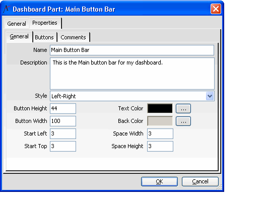
General Sub-Tab
Name (required)
The Name field stores the name of the button bar part.
To prevent problems during any future data migration, assign the button bar a unique name that is unlikely to be duplicated by another button bar.
Description
The Description field contains the description of the button bar part.
Style (required)
The display style of the button bar is specified in the Style field. The standard values are:
- Left-Right: Selected by default. The button bar displays horizontally on the dashboard.
- Top-Bottom: The button bar displays vertically on the dashboard.
Button Height
Button Height defines the default height of each button on the button bar. The default value is 44 pixels.
Button Width
Button Width defines the default width of each button on the button bar. The default value is 100 pixels.
Start Left (required)
Start Left indicates the left position of the button bar. This value is used for automatic positioning only. The default value is 3 pixels.
Start Top (required)
Start Top indicates the top position of the button bar. This value is used for automatic positioning only. The default value is 3 pixels.
Back Color (required)
Back Color defines the background color of the button. The default value is gray.
Text Color (required)
Text Color defines the color of any text on the button. The default value is black.
Space Width (required)
The Space Width field defines the width, in pixels, between buttons. This value is used for automatic positioning only. The default value is 45 pixels.
Space Height (required)
The Space Height field defines the height, in pixels, between buttons.This value is used for automatic positioning only. The default value is 45 pixels.
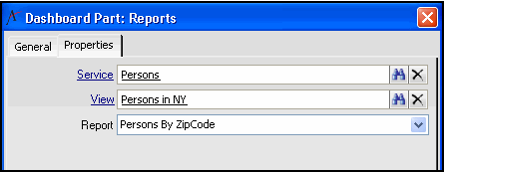
Aptify Report Component
The following input properties appear on the Properties tab of the Dashboard Part form when the Aptify Report Component is selected.
Service (required)
The Service field stores the entity on which the report is based.
View
The View field stores the view through which the report filters.
Report
The Report field stores the report that runs on the dashboard.
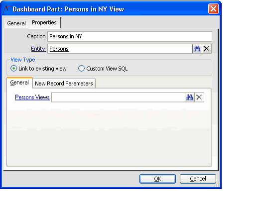
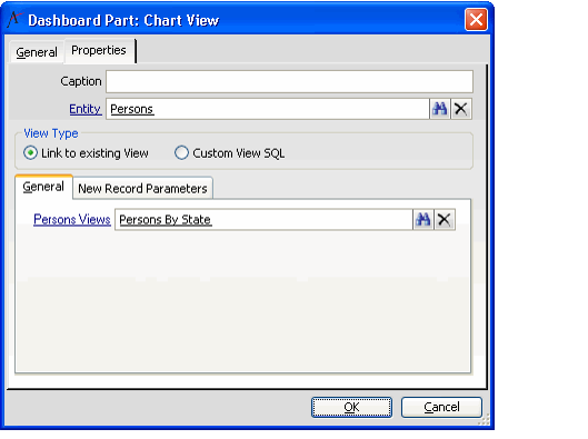
Entity List View Component
The following input properties appear on the Properties tab of the Dashboard Part form when the Entity List View component is selected.
Caption
The caption for the entity list view.
Entity
The name of the entity on which the entity list view is based.
View Type
The type of view displayed. The possible values are: Link to existing View or Custom View SQL.
New Record Parameters
The parameters to pass to all new record forms opened from the entity list view displayed (for advanced users).
Most Recently Used Records Component
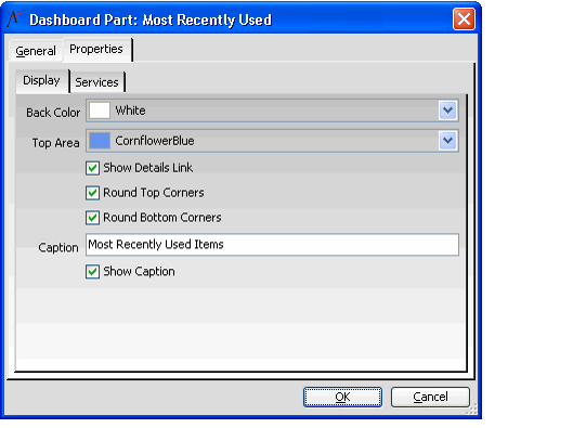
The following fields appear on the Properties tab of the Dashboard Part form when the Most Recently Used Records component is selected:
Display Sub-Tab
Back Color
The background color for the dashboard part.
Top Area
The background color for the top area of the part.
Show Details Link
Select this option to display the Details... link option on the dashboard part to open the Aptify Most Recently Used Records dialog.
Round Top Corners
Select this option to display rounded top corners in the dashboard part.
Round Bottom Corners
Select this option to display rounded bottom corners in the dashboard part.
Caption
Enter a caption for the dashboard part. The caption defaults to Most Recently Used Records for parts that use the Most Recently Used Records component.
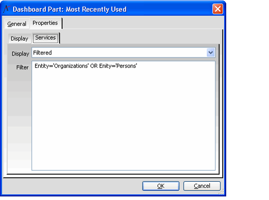
Services Sub-Tab
Display
Select All Entities to display all records from services that have Most Recently Used enabled, or Filtered to use a WHERE clause to limit the set of displayed records to a list of specified services. See Configuring the Most Recently Used Records Component for more information.
Filter
Specify a WHERE clause (without the WHERE prefix). Note that this clause can incorporate any from the Entity Most Recently Used List service, but typically most users will reference the Entity field, as shown below.
Multi Entity Grid Component
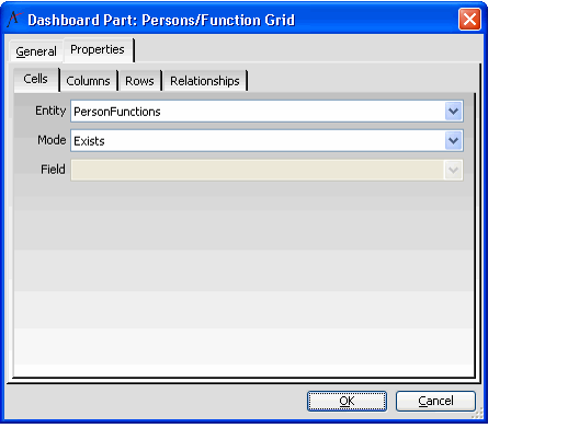
The following fields appear on the Properties tab of the Dashboard Part form when the Multi-Entity Grid component is selected (see Configuring the Multi Entity Grid Component for more information):
Cells Sub-Tab
Entity
The sub-type entity that provides a relationship between the two services specified as the grid's rows and columns. Note that one of the services (either the rows or the columns) must be the parent for this sub-type entity.
Mode
Select Exists to display a checkbox that identifies if a corresponding subtype exists or does not exist. This option is only suitable if the only required fields in the sub-type are links to the row and column services or have a default value specified. Select Field to display the value of a particular field in the specified sub-type entity.
Field
If you selected the Field option as the Mode, select the field from the sub-type entity whose values you want to display in the grid's cells. Users will be able to modify these values directly within the grid.
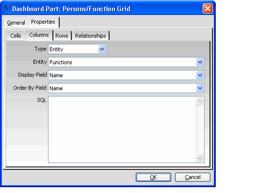
Columns Sub-Tab
Type
Select Entity to add a column for each record in the selected entity. If you want to limit the number of columns to a particular sub-set of records, select the SQL type and enter a SQL statement that returns only the desired records.
Entity
The entity whose records should appear as columns in the grid.
Name
The field whose values display as the column headings.
Order By Field
The field by which the columns are sorted in the grid (in ascending order).
SQL
If you selected a Type of SQL, enter the SQL statement that will return the desired sub-set of records from the specified entity.
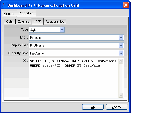
Rows Sub-Tab
Type
Select Entity to add a row for each record in the selected entity. If you want to limit the number of rows to a particular sub-set of records, select the SQL type and enter a SQL statement that returns only the desired records.
Entity
The entity whose records appear as rows in the grid.
Name
The field whose values display as the row headings.
Order By Field
The field by which the rows will be sorted in the grid (in ascending order).
SQL
If you selected a Type of SQL, enter the SQL statement that will return the desired sub-set of records from the specified entity.
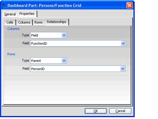
Relationships Sub-Tab
Type
If the row/column entity is the cell sub-type entity's parent entity, select Parent. If the cell sub-type entity has a linked field to the row/column entity, select Field.
Field
Select the corresponding field from the cell sub-type entity that links it to the row/column entity (typically, this is a field named [row/column entity]ID).
Outlook Component
The following fields appear on the Properties tab of the Dashboard Part form when an Outlook component is selected. The Outlook components available on the Component drop-down menu are: Calendar, Contacts, Email, Journal, and Tasks.
Outlook Folder
The dashboard part displays the Outlook Folder selected in the Outlook Folder field, if the user has that folder configured in their Outlook settings.
View Type
Specifies the particular view to use for the display of an Outlook dashboard component. See Configuring the Outlook Components for the available Outlook components and associated view types.
Pending Changes Console Component
The following input properties appear on the Properties tab of the Dashboard Part form when the View Container component is selected.
Selecting the Pending Change Console Component for a part displays the Pending Changes Viewer in the dashboard. This is the component that appears in the Replication Administration application's dashboard by default. Note that replication functionality is deprecated in the Aptify 5.5 release, and is provided for backward compatibility purposes.
Service and View Browser Component
The following input properties appear on the Properties tab of the Dashboard Part form when the Service and View Browser component is selected:
ApplicationID
Specifies the application whose services appear in the dashboard part. If you specify an ApplicationID, then this overrides any value for the EntityID property. For the ApplicationID property, enter Static Value in the Source Type column and the ID of the application to which the dashboard applies in the Source column.
For example, if you are creating a dashboard for the Customer Management application, the only applicable option for this field is 31, which is the Application ID of the standard Customer Management application in Aptify.
EntityID
Specifies an entity whose views and folders appear in the dashboard part. In the EntityID field, enter Static Value in the Source Type column and the ID of a service in the Source column. This property is only valid if ApplicationID is blank. When specified, the dashboard part displays the selected entity's Service Browser (which lists the service's available folders and views). You can only specify the Entity ID of a top-level service that is contained within the dashboard's application.
For example, if you are creating a dashboard for the Customer Management dashboard, you can specify EntityID 1006 for the Persons service (since -Persons is in Customer Management) but not EntityID 969 for the Orders service (since Orders in not in Customer Management, by default).
View Container Component
The following input properties appear on the Properties tab of the Dashboard Part form when the View Container component is selected.
Caption
The caption for the view.
Entity
The name of the entity on which the view is based.
View Type
The source of the view to display. The possible values are: Link to existing View or Custom View SQL.
New Record Parameters
The parameters to pass to all new record forms opened from the view displayed (for advanced users).
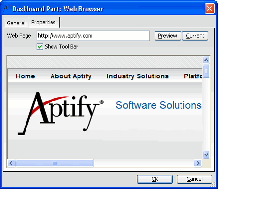
Web Browser Component
The following fields appear on the Properties tab of the Dashboard Part form when the Web Browser component field is selected.
Web Page
The Web Page field contains the URL of the web page that displays in the dashboard part.
Show Toolbar
Show Toolbar indicates whether the browser toolbar is visible when the web page part is displayed.
Copyright © 2014-2019 Aptify - Confidential and Proprietary
