/
Adding a Dashboard Button
Adding a Dashboard Button
Perform the following steps to add a button to a dashboard:
- Open the Dashboard Part form for the Button Bar that you want to edit.
- Click the Options... link from the upper-right hand corner of a personal dashboard.
- Select Edit "<Dashboard Name>" from the context menu.
- Select the Layout tab on the Dashboard Options form.
- Open an existing Button Bar part or create a new part that uses the Button Bar component.
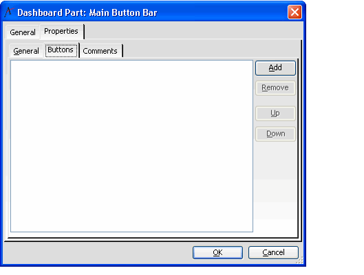
- On the Button Bar form, select the Properties tab, and then select the Buttons sub-tab.
- Click Yes if prompted to save the Button Bar before continuing.
- Click Yes if prompted to save the Button Bar before continuing.
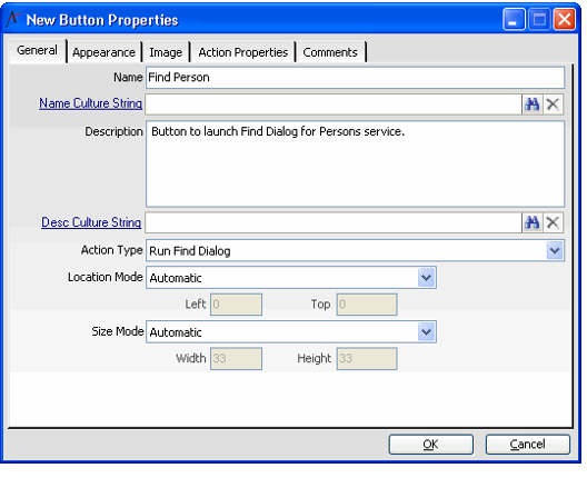
- Click Add to open the Button Properties form.
- Enter a name for the button in the Name field.
- Enter a culture string in the Name Culture String field to localize the button's display name (if desired). See Using Localization Administration for more information or contact your administrator if you need assistance.
- Enter a description of the button in the Description field.The description appears as the button's tool tip when a user mouses over the button.
- Enter a culture string in the Desc Culture String field to localize the description of the button (if desired).If specified, the applicable culture string appears as the button's tool tip. See the Using Localization Administration for more information or contact your administrator if you need assistance.
- Select an Action Type from the drop-down list.
- See Configuring the Button Action Types for information on the available button action types.
- See Configuring the Button Action Types for information on the available button action types.
- If you want to specify the button's exact location on the part, select Manual from the Location Mode drop-down list and enter the button's Left and Top positions in the fields provided.
- Aptify recommends that you leave Location Mode set to Automatic to let the dashboard automatically place the buttons for you (particularly if your button bar will have more than one button).
- If specifying a manual location, enter a value in pixels for the button's Left and Top positions. The Left and Top fields indicate where to place the button in relation to the part's upper left corner (which corresponds to a Left position of 0 and a Top position of 0).
- If you want to specify the button's size, select Manual from the Size Mode drop-down list and enter the button's Width and Height in the fields provided.
- If you leave Size Mode set to Automatic, the button uses the default Button Height and Button Width defined on the Button Bar's General tab.
- If specifying the button size manually, enter a value in pixels for the button's Width and Height.
- Click the Appearance tab.
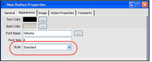
- Specify the button's appearance by configuring the following properties:
- Text Color: The color of the button's text. By default, the text color is black. To select a different color, click the ellipsis (...) button to open the Color Selection dialog. See Selecting Dashboard Colors. Note that this field is not applicable if the button's Style is System.
- Back Color: The button's background color. By default, the background is gray. To select a different color, click the ellipsis (...) button to open the Color Selection dialog. See Selecting Dashboard Colors. Note that this field is not applicable if the button's Style is System.
- Note that changes made to the dashboard button's background on systems using XP or Vista themes may not be visible. Changes to the button's background colors are visible with Windows 2003 and 2008 themes.
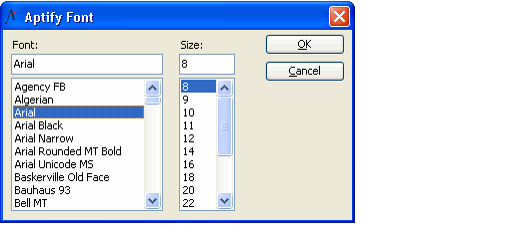
- Font Name: The font used by the button's text. By default, the font is Tahoma. To select a different font, click the ellipsis (...) button to open the Aptify Font dialog (shown in the figure below).
- Font Size: The size of the button's text. By default, the font size is 8 pt. You can enter a different font size in this field or within the Aptify Font dialog (shown in the figure above).
- Style: This parameter determines the button's appearance and border type. The options are Flat, Popup, Standard, and System. System is the default style.
- To see how these border options differ, select a Style, click the Image tab, and click the button sample shown in the Button Preview.
When set to System, the button always uses black as the text color and the background color is gray, even if you specify a different Text Color and Back Color.
You cannot add an image to a button if the button's Style is System.
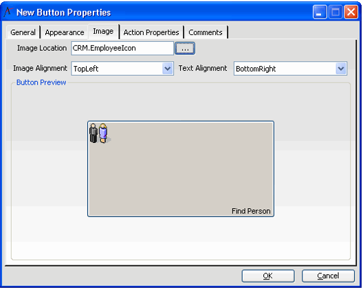
- Click the Image tab.
- To add an icon to the button (for buttons whose Style is not System), specify the location of the image file within the Aptify Object Repository in the Image Location field.
- The Image Location field is only applicable for button's whose Style is set to Standard.
- Contact your administrator if you need assistance with placing files in the Object Repository.
- If you specified an image in the Image Location field, select a location for the image on the button from the list of available options in the Image Alignment field (for example, select TopLeft to place the image in the upper left corner of the button).
- Specify the location of the text on the button from the list of available options in the Text Alignment field (for example, select BottomRight to place the text in the bottom right corner of the button).
- Select the Action Properties tab.
- Define the properties for the selected Action Type.
- The properties to configure differ depending on the Action Type selected. See Configuring the Button Action Types for information on the properties required for each type.
- The properties to configure differ depending on the Action Type selected. See Configuring the Button Action Types for information on the properties required for each type.
- Click the Comments tab to add additional information concerning this button, as needed.
- Click OK to save the button and return to the Button Bar Properties dialog.
- Add additional buttons as necessary.
- When finished, click OK to close the Button Bar Properties dialog, and click OK again to close the Dashboard Options dialog.
- The new button(s) appear on the dashboard.
, multiple selections available,
Related content
Adding a Dashboard Button
Adding a Dashboard Button
More like this
About the Dashboard Buttons Form
About the Dashboard Buttons Form
More like this
Adding a Dashboard Part
Adding a Dashboard Part
More like this
Adding a Dashboard Part
Adding a Dashboard Part
More like this
Configuring the Button Bar Component
Configuring the Button Bar Component
More like this
Configuring the Button Bar Component
Configuring the Button Bar Component
More like this
Copyright © 2014-2019 Aptify - Confidential and Proprietary
