Defining the Wizard User Experience Tab
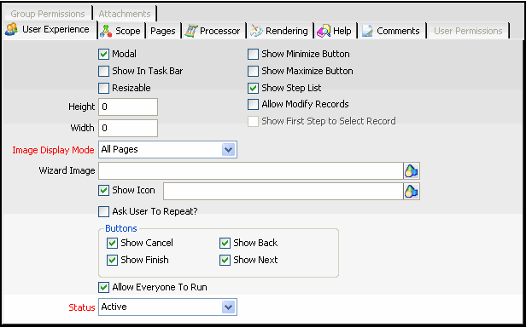
Complete the fields on the User Experience tab to configure the behavior of the wizard and then save the Wizards record. This tab contains the options described below.
Modal
When selected, the wizard is modal and is displayed at the front of the application (cannot be sent behind another window). This is suitable if you believe a user needs to complete the wizard once launched.
Show In Task Bar
When selected, the wizard is added as an item in the Windows task bar at the bottom of the user's screen. This is only applicable when a user runs the Windows desktop application.
Resizable
When selected, the user can resize the wizard dialog.
Height
When greater than 0, this field specifies the height of the wizard dialog in pixels. However, if left at 0, the recommended and default value, the system automatically calculates the height by choosing the maximum height required to properly display the tallest page within the wizard.
Width
When greater than 0, this field specifies the width of the wizard dialog in pixels. However, if left at 0, the default value, the system automatically calculates the width by choosing the maximum width required to properly display the widest page within the wizard. Note that if the wizard displays an image and/or step list, then you should manually specify the width because the calculated width does not take these items into account (so the calculated width may not be wide enough).
Show Minimize Button
When selected, the minimize button appears in the upper right corner of the wizard dialog and the user can minimize the wizard.
Show Maximize Button
When selected, the maximize button appears in the upper right corner of the wizard dialog and the user can maximize the wizard so it fills the entire screen.
Show Step List
When selected, the wizard includes a step list on its left side that indicates each step in the wizard (it displays the name of each page specified on the wizard's Pages tab). Within the step list, the current step is displayed in bold.
Allow Modify Records
When selected, the wizard can modify existing records in the target entity (as well as create new records if applicable). To load an existing record into the wizard, a user either selects a record from the source view or enters a record in the First Step link box (described below).
Note that if are designing a wizard to operate on a set of records based on selections in a view from the source entity (which may be different from the target entity), you would use the SelectedItems property to pass in the IDs of those records to the wizard. See Using Process Flows to Add Functionality and Conditional Paging Logic for more information on this property.
Show First Step to Select Record
This option is only available when Allow Modify Records is selected. When selected, the wizard displays a link box dialog after the user launches the wizard for the first time. The link box is linked to the wizard's target entity. The user can then enter the existing record to modify. Note that if a user selects a record from a view before launching the wizard, the wizard pre-populates the link box with that record, assuming the wizard is launched from the target entity's view toolbar.
If this option is cleared and Allow Modify Records is selected, the user selects a record from the list view. This record's information is then passed into the wizard. However, the wizard will display the link box for subsequent runs of the wizard (if Ask User To Repeat? is enabled).
Note that if the user does not select any records before launching the wizard, the wizard will create a new record rather than modify an existing record (assuming a user provides values for all of the record's required fields).
Image Display Mode
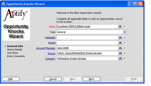
Determines when the specified Wizard Image is displayed within the wizard. When applicable, the wizard image appears in the upper left corner of the wizard dialog, as shown below. The options are All Pages (on every page), First Page Only (only on first page), and None (do not display a wizard image).
Wizard Image
The Object Repository location of the image to display in the wizard. For best results, a typical wizard image should be around 125 pixels wide by 150 pixels tall.
Show Icon
When selected, the specified icon appears in the caption in the wizard dialog's upper left hand corner (to the left of the wizard name). If not specified, the wizard uses the default Aptify "A" as its icon. The text box to the right of the check box identifies the Object Repository location of the icon to display. In the example below, the wizard uses the Aptify Opportunities icon. Note that even if Show Icon is cleared, Aptify will use the specified image as the icon for the wizard when it is available on a view toolbar.
Ask User To Repeat?
When selected, the wizard asks the user if he or she wants to rerun the wizard again after completing an iteration. Note that for wizards that have the Allow Modify Records option enabled, the wizard displays a link box to let the user specify another record in the Target Entity to update (or create a new record by leaving the link box blank).
Show Cancel
When selected, the Cancel button appears in the wizard's button bar across the bottom of the dialog.
Show Finish
When selected, the Finish button appears in the wizard's button bar across the bottom of the dialog.
Show Back
When selected, the Back button appears in the wizard's button bar across the bottom of the dialog.
Show Next
When selected, the Next button appears in the wizard's button bar across the bottom of the dialog.
Allow Everyone to Run
If you want this wizard to be available to all users, select the Allow Everyone to Run option. If the wizard should only be available to a sub-set of users, clear the Allow Everyone to Run option and specify the appropriate Groups and/or Users on the Group Permissions and User Permissions tabs.
Status
When set to Active, the wizard is available for the users who have permission to it. When set to Inactive, the wizard is unavailable for all users.
Related content
Copyright © 2014-2019 Aptify - Confidential and Proprietary


